Friday, July 18, 2008

Liquid Emboss Photoshop Text Effect

STEP 1
Create a new 640x480 RGB file with black background and create a title using Blue text. You can use this color #2fc1fe. Center it on the page.


STEP 2

Duplicate the layer.Now, we will be adding a few effects to the layer.

First apply an Inner Shadow with these values.
Now we will apply a Bevel.


STEP 3

Now, load the selection by going to Select > Load Selection and then go to Select > Modify > Border - Use the value 15
Create a new layer and stroke it with 2 pixels.


Go to filter > Stylize > Wind - One from Left and One from Right

Monday, July 14, 2008

Making Flame Effect

Start a new RGB document (size around 640x480) filled with black background.
Use the type tool and create a new text in WHITE and position the text centered in the lower half of the document.


Now roate the new layer 90CW. (Edit->Transform->Rotate 90CW)

Now apply the Wind Filter to this new layer (Filter->Styleize->Wind)
Method: Wind, Direction: From the Left.

Press CTRL+F 3 times to reapply the filter 3 more times.
Now rotate the image back to normal: Edit->Transform->Rotate 90CCW


Now go to Image->Hue/Saturation
Check the "Colorize" Box. Set Hue to 40 and Saturation to 100
Now apply some Hue saturation to the new duplicated layer:
Now set the duplicated layer's blending mode to: Color Dodge

Now go to Layer->Merge Down To merge the 2 layers together.


Now to create our flames, we go to Filter->Liquidfy. Now with the Warp tool selected, set brush size to between 40 and 50, and brush pressure to around 40 to 45.

Now just click and drag from the white edge of the text to wiggle your way into the orange to create the flame.
Next, change your brush size to about 30, and pressure to about 30, and go for 2nd round of creating your flame, hit OK.


Now move the original text layer to the top on the layers pallete, and change it's color to black.


Now go to Layer->Rasterize->Type to rasterize the text layer. Now use the Add layer mask, and erase out the top half of the text.


Now, if you want to create a reflection, do a selection about half of the bottom part of the flame.

Thursday, July 10, 2008

Making Smoke Effect

STEP 1

open a new image, it doesn’t really matter what size but be sure to set your background color to black. (this effect generally looks its best on a black background.) Make a new layer and select the "Polygonal lasso tool" and create an abstract shape that looks similar to the example below


STEP 2

Now we can start our highlights of our smoke. Select the "Dodge" tool and make the brush size around "50" and the "Range" to "highlights." Now use this tool around the edges and corners of your shape. Next, select the "Burn tool" and use it in the middle and wherever you see fit.


STEP 3

Here we can make it look like smoke now. Go to "filter"/"Distort"/"Wave." And make the settings as follows:
- Generators "5"
- Wavelength "10"/"120"
- Amplitude "5"/"35"
- Scale at "100%" for both.

you have used the "wave" filter you can go to "Edit"/"Fade-Wave" and set the opacity to "50%." Now repeat this distort and fade method many times, or until you think it looks best.

And then you have used the "wave" filter you can go to "Edit"/"Fade-Wave" and set the opacity to "50%." Now repeat this distort and fade method many times, or until you think it looks best.

To make this effect look even better you may have to "distort", resize, and change the blending modes when fading a bit. And lastly, to make it different colors instead of the same throughout. make a new layer and use the "brush" tool all over the place using different colors.

This result making smoke effect :


Making Text Neon

STEP 1

Create a new document 400x400, Fill it with black paint.

Using white as your text colour, type your words of choice. This works for most fonts, I used Lucida Calligraphy. I set the font size to 100pt


STEP 2

Click the (f) in the layers pallet down bottom and click blending options. Set the fill opacity to 0, like pictured.


STEP 3

In the blending options window, Click outer glow and apply the settings pictured.
and then click stroke and apply the settings as pictured.
For gradient example see next step


STEP 4

Your final image should look very much like mine. (You can use pretty much any colour you like, Just modify the gradient to match.)

Wednesday, July 9, 2008

The Photoshop Sketch Effect

STEP 1

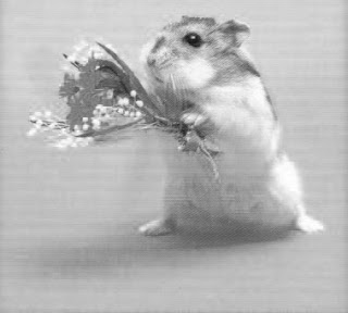
The most important part of this photoshop tutorial is choosing the right photo. In my opinion, I found the photoshop sketch effect looked best on a high-contrast image with a simple background. Anyways, once you decide what image you want to use, Duplicate the layer.

You now want to Desaturate the newly created layer

Image » Adjustments » Desaturate

STEP 2

Once your image has been Desaturated, duplicate the layer.

You should now have three layers - (1) Color & (2) Desaturated Layers

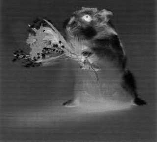
This new duplicated layer should now be located above your Desaturated layer on the layer palette. We will now Invert this layer.

To do this you must have the new layer selected, and then go:

Image » Adjustments » Invert

Your result should be similar to the image on the above.

STEP 3

Now, with the Inverted Layer selected, you must change the Blending Mode to “Color Dodge.” If your image just turned all white with a few black specks or lines, don’t worry. Thats what you want it to do. Now, you will go add a Gaussian Blur to the inverted layer.

Filter » Blur » Gaussian Blur

Now, you must choose what size pixels to set your Radius Blur to. This all depends on your image, but for this particular image, I choose 5px.

That's result draw from my editing.

Light the Eyes

In this tutorial I will show you how to change eye color.
We will get eyes like this:


Get a picture, something where the eyes stick out a bit more. I will be using this picture of my pet. It is perfect for this tutorial. Make sure that the picture you are using is a layer, not the background.


We'll take a picture where the eyes are shown very well. It's very important because the more qualitative the picture is, the better effects will be. It's desirable that the eyes should be light-colored. If they are brown then we'll use the instrument Dodge tool and make them lighter.


Choose from the instruments panel a brush having approximate dimensions as the eyes (hardness 30%). On mouse click and we'll put the circles on the eyes.


Now on the same layer choose the color regime. The eyes become lighter.


that's result draw from my editing. :)